
When we choose a wall colour, we often go by taste alone. Yet the same colour looks different in a sunny living room and in a north-facing room, and has a different effect on a large wall than in a small alcove.
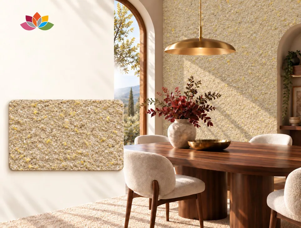
The texture of cotton plaster also changes how a colour is perceived. Its fibrous, matt surface does not reflect light like a mirror; it diffuses it softly. That is why colours look deeper and warmer than they would on a glossy surface.
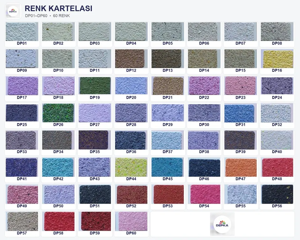
Four colour families
Natural tones
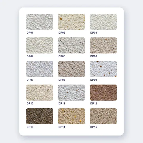
White, cream, beige, grey and earth tones. A calm, timeless backdrop that lets furniture and accessories stand out.
DP01–DP15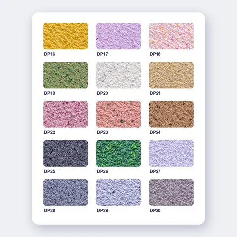
Pastel tones
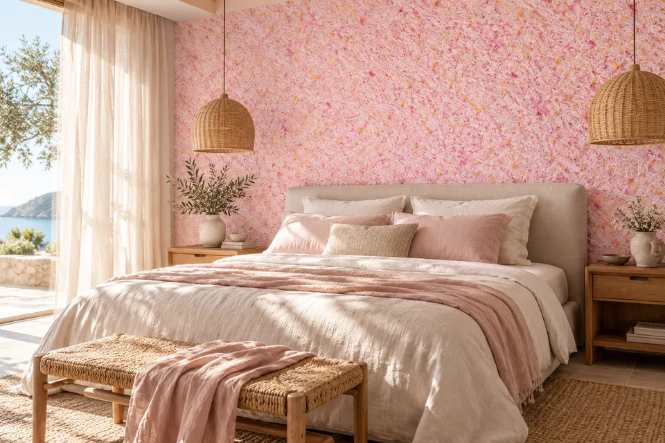
Lemon yellow, lilac, powder pink and greens. A soft, airy feel for bedrooms and children's rooms.
DP16–DP30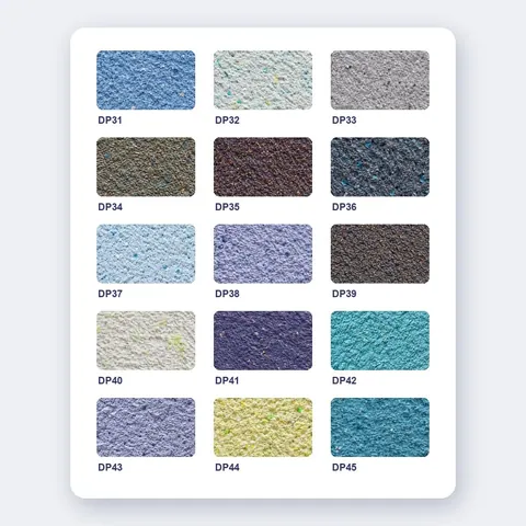
Blue and turquoise
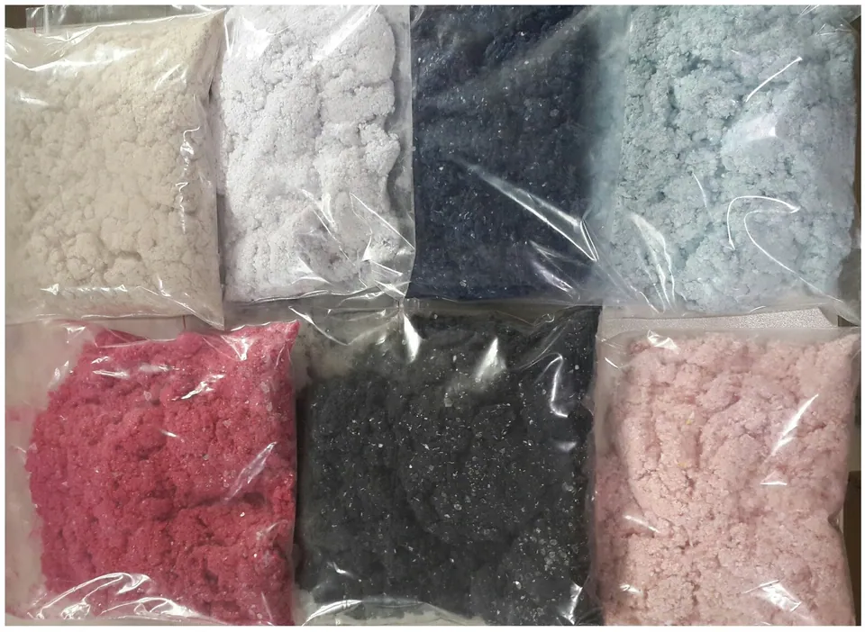
Sky blue, turquoise, petrol blue, lilac-blue and grey-blue tones. A cool, airy and tranquil effect.
DP31–DP45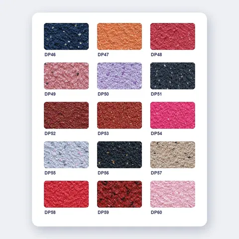
Warm and vivid
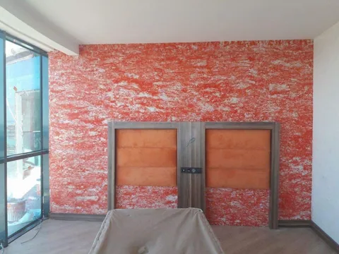
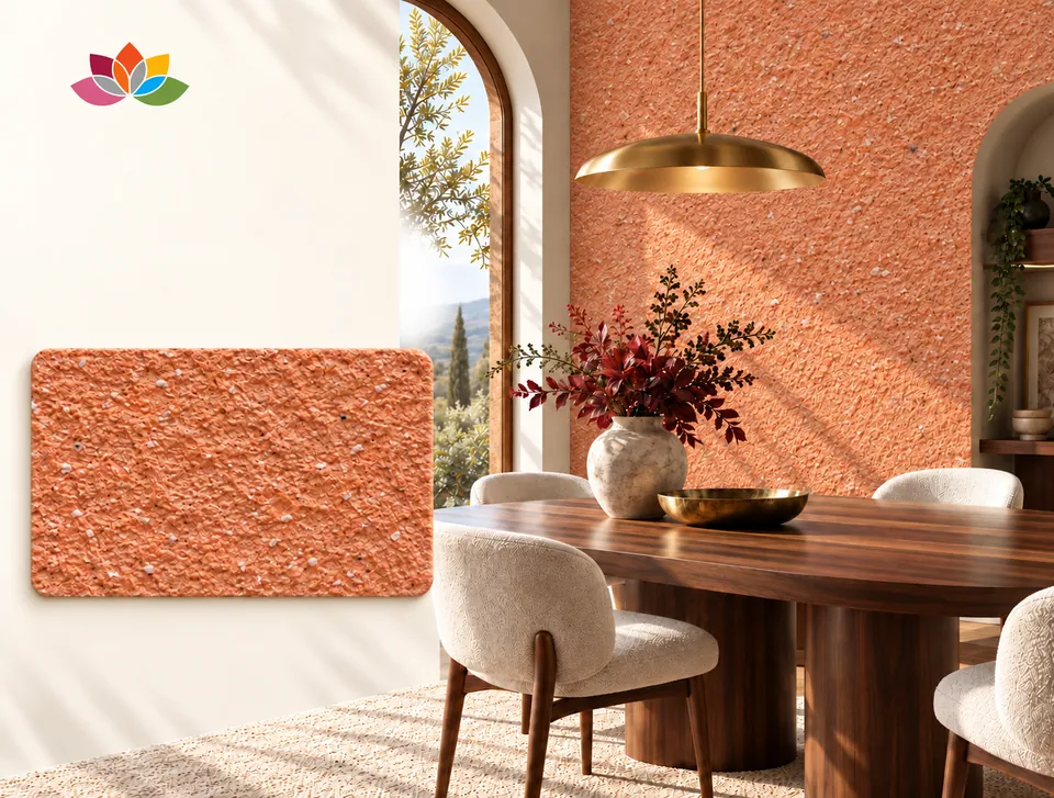
Coral, red, burgundy, pink, navy and anthracite. Strong character for feature walls and social spaces.
DP46–DP60Choosing colour by room
Living room
Natural tones make a balanced backdrop on large walls; a warm colour on a single wall adds character.
Bedroom
Pastel and blue tones are popular choices for a calm, restful atmosphere.
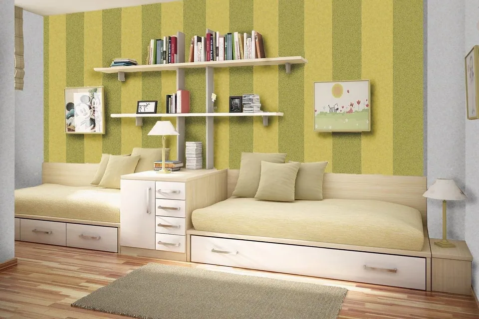
Children's room
Polka dots, stripes or figures in vivid colours can be added over a pastel base.
Office and meeting room
Natural and grey-blue tones give a clean, corporate look; your brand colour stands out on a feature wall.
Shop, café, restaurant
Warm, vivid colours carry your brand identity onto the wall and make the space memorable.
Hotel
Natural tones in corridors and the lobby; an accent colour on the headboard wall in the rooms.
Light, size and accents
- Light: Cool tones sit well in sunny rooms; in rooms with little light, pale and warm tones make the space look brighter.
- Size: Pale and natural tones make small rooms feel more spacious. Use dark colours on a single feature wall.
- Ceiling: Cotton plaster can also be applied to ceilings. Choosing a ceiling one shade lighter than the walls makes a room look taller.
- Mixed colours: By combining two or three colours you can create veined, marble-look or patterned surfaces. The methods are on the mixed colours page.
The language of texture and shimmer
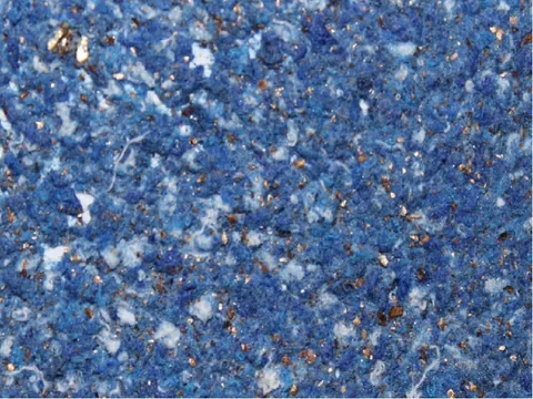
Many cotton plaster colours contain fibres and flecks in different shades. Seen up close, the colour is not flat but lively, and this texture gives the wall depth.
If you would like to add shimmer to a wall, you can mix gold or silver mica into the cotton plaster. The mica particles glint softly as the light catches them.
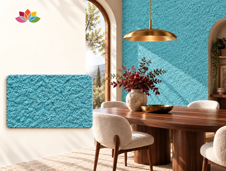
Colour visualiser
Try the colour in a room
Tap a colour and watch the room change.
Natural tones
Pastel tones
Blue and turquoise
Warm and vivid
About on-screen colours
Colours can look different depending on your screen's brightness and colour settings. The room images are designs made to show the colour. If you are unsure, send a photo of your space on WhatsApp (+90 532 059 87 83) and we will choose the colour together.
About choosing a colour
How many colours are there?
There are 60 main colours (DP01–DP60), in four families of 15: natural, pastel, blue-turquoise and warm-vivid. You will find them all on the colour chart page.
Can I mix the colours?
Yes. You can blend colours dry or combine separate batches on the wall. The methods are on the mixed colours page.
Does the colour fade over time?
No. The colour of cotton plaster does not fade, and no colour difference appears where it has been repaired.
Do you have shades similar to silk plaster colours?
DEPKA does not sell silk plaster; our colour chart is for cotton plaster, a natural alternative to liquid wallpaper. It offers a wide palette, from natural tones to vivid colours, with 60 main colours and mixed options.